Friday, March 11, 2011

J10


    • Links to the blogs of all of your teammates on A05 and your J08 & J09 posts.
    • mble_Be
      http://dsgn200bmblb.blogspot.com/
      Ben
      http://cutelilkittens.blogspot.com/
      Ian
      http://studblgigw.blogspot.com/
      Julia
      http://idowhatthecoolkidsdo.blogspot.com/
      Rachel
      http://racheltdsgn200.blogspot.com/


    • Reflects on the project as a whole. Wrap it up. What did your team work on? What decisions were made? How did the team work, both organizationally and personally
    • My team was designing the cooking pot. We, firstly, just came out with random idea of the product, such as the advantage and disadvantage of the product. Then we work as a group decided about what customer that would fit our product and company. We write out a possible situation of our possible customers. Then we kinda start to design the cooking pot. Then the packaging and the marketing. Finally, we were working on the final presentation. We meet at the library and briefly before the class to work on the project. I learned a lot by working with my roommate.
    • Reflects on your personal contributions to the project. What roles did you fulfill? What did you bringt to the table/conversation? What do you feel you did well? What more could you have done to facilitate the project? General feelings on the project? Etc...
    • I was in charge of the packaging. I provided the idea that i can think of. And our team member sketched our idea on the paper and we discuss our idea with other team member. I feel like i had learned a lot through the project. And I learned to compermise and work with my teammates. 

    CR10

    -I like the way you gave out the card and separate the group.
    -But I kinda hate the reading assignment. I feel like some of the reading is not that necessary.
    -I really like the movie and the video that were show during the class. It is really interesting. And it makes the class more fun.
    -I think the class is kinda fun, but I don't really feel like learning a lot of things from the class.

    Monday, March 7, 2011

    J09


    The goal on this Journal Activity is to be supportive of your A05 activities. For J09, create a post on your blog that does all of the following:
    • Links to the blogs of all of your teammates on A05.


    Bumble_Be
    http://dsgn200bmblb.blogspot.com/
    Ben
    http://cutelilkittens.blogspot.com/
    Ian
    http://studblgigw.blogspot.com/
    Julia
    http://idowhatthecoolkidsdo.blogspot.com/
    Rachel
    http://racheltdsgn200.blogspot.com/


    • Reflects on the state of the project as a whole. What has your team been working on? What decisions have been made? What directions have you been heading in? How has the team been working, both organizationally and personally? Etc...


    My team has been working on the logo of the coleman home,  marketing process, packaging and the powerpoint that we are going to show on class. We designed a special lamps for the logo of the company, and we also decided to use green and sand color for the word's logo. our team met outside of the class a lot. We had many ideas came out from the project. 


    • Reflects on your personal contributions to the project thus far. What roles have you been fulfilling? What have you brought to the table/conversation? What do you feel you have been doing well? What more could you be doing to facilitate the forward progress of the project? General feelings on the project? Etc...


    I am in charge of the packaging of the project. I designed the fabric bag for the packaging with a zipper on it. And we will print the logo on it. This bag is not like other packagings, it can be used again and again, and its really convenient. I feel like through this project, i can see how does a product designed. what process should the designer went through. 


    • Documents the work being done on the project. Do you have scans of sketches you have done? Photographs of work happening? Notes, minutes, outlines, mind-maps, drafts, ideations, images, time-lines, goals, or any other evidence of the project's progress thus far? Etc...


      Monday, February 28, 2011

      RR08

      The last two chapter of "Design" from John Heskett talks about the context and the future of the design. The context of the design basically include the business, professional organization and the government. Design has various form, not every design is being universally understood. Some time, it really depends on the consumer's view on the product and how the company advertise their product. However, the design follows some specific pattern throughout the history. 
      In chapter 10, the author talked about the future of design. He said that design cannot remain isolated from these wider patterns. We should considered all kinds of situation while we are designing products. 

      J08


      • Links to the blogs of all of your teammates on A05.
      Bumble_Be
      http://dsgn200bmblb.blogspot.com/
      Ben
      http://cutelilkittens.blogspot.com/
      Ian
      http://studblgigw.blogspot.com/
      Julia
      http://idowhatthecoolkidsdo.blogspot.com/
      Rachel
      http://racheltdsgn200.blogspot.com/

      • Reflects on the state of the project as a whole. What has your team been working on? What decisions have been made? What directions have you been heading in? How has the team been working, both organizationally and personally? Etc...
      Our team has been discussing about what kind of user and what design environment we would focus on. We define the user, type of family, and the problems in those family. We have talked about many problems and creative improvement in the home products design. And we are focusing on solving space, money, safety, and accessability of our product. 

      • Reflects on your personal contributions to the project thus far. What roles have you been fulfilling? What have you brought to the table/conversation? What do you feel you have been doing well? What more could you be doing to facilitate the forward progress of the project? General feelings on the project? Etc...
      So far, I have been participated in the group as a good listener. I did come up with some ideas and also listen to others idea. I feel like i should talk more and provide more ideas for my group. 

      • Documents the work being done on the project. Do you have scans of sketches you have done? Photographs of work happening? Notes, minutes, outlines, mind-maps, drafts, ideations, images, time-lines, goals, or any other evidence of the project's progress thus far? Etc...
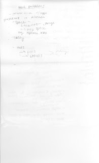
      Since my group is generally discuss together during the class. We didn't do a lot of sketching and specific drawing. We took the note together during class. We also set up a drop box for our team member to post their thought online.
      Here are some document that we draw during the class:


      Brainstorm:
      1
      http://dl.dropbox.com/u/21715277/design%20public/coleman%20brainstorming1-%20definitions%2Ccategories%20and%20problems.jpeg
      2
      http://dl.dropbox.com/u/21715277/design%20public/coleman%20brainstorming2-problem%20list%20continued.jpeg
      3
      http://dl.dropbox.com/u/21715277/design%20public/coleman%20brainstorming%203%20user%20and%20statements-strategies.jpeg
      4
      http://dl.dropbox.com/u/21715277/design%20public/coleman%20mind%20map.jpeg

      Sunday, February 20, 2011

      J07


      • Links to the websites of 5 manufacturers or retailers who specialize in outdoor camping and recreation products.
      http://www.slumberjack.com/

      http://www.wenzelco.com/

      http://www.garmont.com/ski/ita/  
      (Italian manufacturer of backpacking and mountaineering footwear.)

      http://www.kelty.com/
      (Sleeping bags, tents, and internal and external frame backpacks.)

      http://www.optimusstoves.com/seen/
      (Hiking, marine, camping and expedition stoves.)


      • 3 images of trade show / exhibition booths from the outdoor recreation and sporting industry.


       Adidas 
      Timberland


      • Links to the websites of 5 manufacturers or retailers who specialize in indoor home goods products.
      http://jump.dexigner.com/directory/5620

      http://www.furnitureseen.com/
      (Modern furniture design)

      http://jump.dexigner.com/directory/10637

      http://www.itoki.jp/english/
      http://www.yliving.com/kartell.html?KEYWORD=kartell&jt=1&sfid=8a8ae4cc1cdf1634011ce3c1b41443aa&jadid=6949483395&jk=kartell&js=1&jmt=1&jkId=8a8ae4cc1cdf1634011ce3c1b41443aa&jsid=9985&&gclid=CPm5jonimKcCFQjrKgodSRnteQ
      (love this one :))

      • 3 images of trade show / exhibition booths from the indoor home goods market.


      • A working definition of what an "indoor home good" is?
      In my perspective, indoor home good is any product that is need at home.

      • 3 images of different types of possible home goods.


      RR07

      Chapter 5,6,7 talks about the waste equal food; Respect diversity; and putting Eco-effectiveness into practice.

       Every natural things on Earth are in cycle. The Earth's major nutrients- carbon, hydrogen, oxygen, nitrogen- are cycled and recycled. As our industry developed, there are more and more natural resources have been taken and made of product for human goods. These product are not designed to be recycled, such as cars and big machines. After we used our goods, we cant recycle them. We are actually damage the cycle of the nature. Besides I like that idea that author suggest in the boo, that all the customers can switch their concept on product. Instead of "own" the product forever, we should developed the concept that we just use these product for certain years. We pay for the product just for the authority to use it but not own it, because once we don't want the product anymore, we cannot totally eliminate them.

      As for the Respect diversity, we all come from different places, and we all have our own cultural background. The author uses a lot of examples to explain how to combine our culture into design product. Even though, a good design should remain universal signs, but it should also design depends on different area and culture. The designer should also consider all aspects of the design.

      The facts and examples in the book are fun to read through.

      CR07

      I like the speech on class. The founders from Cobego seems really passionate about what they are doing, and what they have been through. The students stories and experiences really makes me think about what should I do in the future; is this what I really want in the future. I like the marshmallow experiment a lot. It is really enjoyable and fun to watch at.

      As for the movie that we watched on wednesday's class, it makes me think about the variety and the function of design and designer. There are products that are designed to fulfill human need, and there are also products, which design just for fun or for the experiment. Sometime, I felt that my views on certain subject or object is very narrow. We should open our mind and try to experience more culture and new things in our life, so that there will be more variety in our designs and mind.

      Wednesday, February 16, 2011

      letterform Seek and Find

      "M" Its the SEL 

      "O" The well on campus
      “O"


      "N" The bicycle on campus

      "N" SEL

      "H" Its the bench in the oval 

      "L" The Bench in the Oval 
      "U" The two trees and the ground formed a U

      "V" 

      "V"

      "W"

      "V"

      "W"

      "c" the branch of the tree and the ground formed a C

      I think it can be either "F" or "E"

      "E" the branch of the tree

      "N" 

      "T"

      "V"

      "T"

      "U"

      "Y"

      "I"

      "C"

      "W"

      "F"

      "T" in the elevator 

      "M" the corner of the elevator
      "N" took from church
      "Q"


      Sunday, February 13, 2011

      Design and color

          Color is one of the most important element in design. Different color has different power, it can give people different feeling depends on where we use it. It is really interesting for use to look at the color psychology that is used in design product. For example, here are some powerness and the effect of different color below:

      Black

         Black is the color of authority and power. It is popular in fashion because it makes people appear thinner. It is also stylish and timeless. Black also implies submission. Priests wear black to signify submission to God. Some fashion experts say a woman wearing black implies submission to men. Black outfits can also be overpowering, or make the wearer seem aloof or evil. 

      White

      Brides wear white to symbolize innocence and purity. White reflects light and is considered a summer color. White is popular in decorating and in fashion because it is light, neutral, and goes with everything. However, white shows dirt and is therefore more difficult to keep clean than other colors. Doctors and nurses wear white to imply sterility.

      Red

         The most emotionally intense color, red stimulates a faster heartbeat and breathing. It is also the color of love. Red clothing gets noticed and makes the wearer appear heavier. Since it is an extreme color, red clothing might not help people in negotiations or confrontations. Red cars are popular targets for thieves. In decorating, red is usually used as an accent. Decorators say that red furniture should be perfect since it will attract attention.
      The most romantic color, pink, is more tranquilizing. Sports teams sometimes paint the locker rooms used by opposing teams bright pink so their opponents will lose energy.

      Blue

      The color of the sky and the ocean, blue is one of the most popular colors. It causes the opposite reaction as red. Peaceful, tranquil blue causes the body to produce calming chemicals, so it is often used in bedrooms. Blue can also be cold and depressing. Fashion consultants recommend wearing blue to job interviews because it symbolizes loyalty. People are more productive in blue rooms. Studies show weightlifters are able to handle heavier weights in blue gyms.

      Green

         Currently the most popular decorating color, green symbolizes nature. It is the easiest color on the eye and can improve vision. It is a calming, refreshing color. People waiting to appear on TV sit in "green rooms" to relax. Hospitals often use green because it relaxes patients. Brides in the Middle Ages wore green to symbolize fertility. Dark green is masculine, conservative, and implies wealth. However, seamstresses often refuse to use green thread on the eve of a fashion show for fear it will bring bad luck.

      Yellow

         Cheerful sunny yellow is an attention getter. While it is considered an optimistic color, people lose their tempers more often in yellow rooms, and babies will cry more. It is the most difficult color for the eye to take in, so it can be overpowering if overused. Yellow enhances concentration, hence its use for legal pads. It also speeds metabolism.

      Food for thought 

         While blue is one of the most popular colors it is one of the least appetizing. Blue food is rare in nature. Food researchers say that when humans searched for food, they learned to avoid toxic or spoiled objects, which were often blue, black, or purple. When food dyed blue is served to study subjects, they lose appetite.
      Green, brown, and red are the most popular food colors. Red is often used in restaurant decorating schemes because it is an appetite stimulant.


      Here is the Website that talks more about the color and how it works in the marketing. It is really fun to read these fun fact. And they are use widely in our life. 
      http://www.precisionintermedia.com/color.html

      This web talks about how does color affect our life. Different formation of color can give people different feel. It can also form illusion. 
      http://www.pantone.com/pages/pantone/Pantone.aspx?pg=19382&ca=29


      As we know that color is everywhere in our life. There is a fancy video, which shows the color and the patter of the stain glass window. It has a lot of different style of the window. Most of them are really colorful and create a feel of fantasy.
      This video is fun to look at. The producer change the common color that we see during our life. For example, it makes the restaurant become blue, and specialize people with yellow. At first, you might think the video is uncomfortable, but it is fun to look at.
      To whom really interested into fashion design. This video below talks about the different use of the color can make people looks totally different. It compare the different picture of the same picture and also explain the color effect in the fashion industry.

      Cradle to Cradle chapter 1-3

      The first chapter of the book is "A question of Design". It talks about the brief history of the industrial revolution. During the revolution, those huge machine, which produce tons of pollution and consumes a lot of natural resource, seems inevitable at that time. It took shape gradually, as industrialists, engineers, and designers tried to solve problems and to take immediate advantage of what they considered to be opportunities in an unprecedented period of massive and rapid change. I like the idea that the author was talking about the cradle to grave model. All the furniture, diapers, papers, wood and so on are designed on a linear, one-way cradle to grave model. They are not recycle-able neither environmental friendly. So then, the designer and the architects came up with the idea of One size fit all. Basically, the architecture will use the basic affordable materials. So that there is no distinguish between the rich and the poor.
      The second chapter talks about why being less bad is no good. At first, it talks about the different role the environmentalist play during the decade. They were not interested simply in preservation but in monitoring and reducing toxin.Declining wilderness and diminishing resources merged with Pollution and toxic waste as the major realms of concern.The book also talks about the four R's: Reduce, Recycle, Reuse, and Regulate. At the end of the chapter, the author said that less bad is no good. We cannot just cut back people 's need on the product, but have to think a new way to make the industrial become more eco-efficiency.
      The third chapter talks about the eco-efficienty. It talks about most of the product that we were using now is non recycle-able. We should come up with designs that can use in cycle in our life.

      CR06

      This week during class we watched a movie: Rip!: A Remix Manifesto. It talks about the illegal download music in the United States. The story starts with Girl Talk. Girl Talk remix the famous songs and he takes out part of the song and remix them to make a new song. The movie told us that this behavior is actually illegal, and we can get into prison for five years and also get a huge amount of punishment. Currently in the United States, many people download music illegally. And many people use those illegal download music to create their own art. Whether should we put up a strict law on downloading music brings up a discussion in the society. 
      well, I come from China. As you know, in my country, we don't have a complete law on downloading music. People don't have the conscious to pay for their music. The music industry is at their low point. My favorite band is called MAYDAY. They are really popular in China, and even when the music industry is not prosper right now, they still made a lot of money. And had concert every year. This year, they had a new record come out. When the news reporter ask him how the illegal download on the internet. He said that he cannot prevent the illegally download music, but if people do download free music online, he wants them to download the whole album and listen to the whole album in its original order. His words make me think that good music should not be restrict by forms. It has nothing to do with the business and money. Music is a form of art. Obviously, people should pay for their music, but we can also be creative with our music. The government should not punish the artist like the Girl Talk.... 

      Sunday, February 6, 2011

      CR05

         We watched four video on class. I watched it again when I went back home. The four videos are Janine Benyus's 'Biomimicry in action'; Michael's 'water filter turn filter water drinkable'; Jane chen's 'Warm embrace that save lives'; and William McDonough's 'cradle to cradle'.


         In conclusion, these video are talking about how design relate to our natural resource and lives, and how can design products can save our lives. I like the idea from Jane and Michael's video. Jane and her group design a warm embrace, which can save the life for the unhealthy new born baby. Especially in the poor country in the world, people do not have advanced medical facility, this easy product can help the baby to keep warm, and it is really easy to cary can used. As for Michael, he designed a water filter machine. This can be used especially when the earthquake and serious natural desaster happened. People can easily get the drinkable water from their place, but not waiting for the government to get clean water from other city.  William McDonough with the Cradle to Cradle concept talks about choices and provides 'Love of all children of all species for all time' as a postive conscious choice. He provide us a method to save the world and reduce the pollution by designing the right things in our life. It make me think that design is not only for merchandize or making profit, it should improve our living environment and the benefit to the creatures that around us. 


         As for the lecture on Monday, we talked about the color. I think the Bezold effect is really interesting. And it can apply to a lot of places. I remembered that I had read a book about the color and the psychology. It talks about how color influences people's mood. For example, the fast food usually use red or orange for their wall. It is because red and orange make people excited and eat faster. These examples and applications are really interesting. 

      Cradle to Cradle Introduction

         Before reading this book, we watched the video in class. William McDonough, in his speech, said that our goal is a delightfully diverse, safe, healthy and just world, with clean air, water, soil and power- Economically, equitably, ecologically and elegantly enjoyed.
         As for the introduction of this book, McDonough use many examples to illustrate that most of the designs  around us are made of many materials that cannot be "recycle". In other word, the recycling process may have introduced even more harmful additives that a conventional product contains. McDonough decided to use plastic resins and inorganic fillers to print his book, instead of wood pulp or cotton fiber. In this way, we can save a lot of trees, and the materials that are used in the book can also be recycled easily. McDonough suggested that there should be a new industrial revolution, which can make both industry and environment prosperous.
        I like Bill's theory in the book. He said that "I was tired of working hard to be less bad. I wanted to be involved in making buildings, even products, with completely positive intentions." Bill has worked in different part of the world. People use different materials into design according to their different culture and environment. Japan use paper as window, and they also created the dripped garden. Bill's story also make me think that, sometime, "environmental friendly" is just a title in the industrial world. We add advanced technology to our previous product, yet not think about the original problem behind the product.
         The story of shoe industry also surprised me. The shoe industry use toxic chemical in their product, and the labor who work for the factory will get cancer in 20 years. So the factories only hire labor who is over 50s. Pules, Michael said that "leather" shoes are actually a mixture of biological materials and technical materials. Think about how many shoes do we own in our life? Do we need that many shoes? These "leather" shoes cannot dispose on earth. If we design things do not only think about its profit economically, but also considered the environment, our world will exist much longer.

      50 things about Thompson Library

      1. People choose to sit on a chair with table instead of the sofa.
      2. All the books are in roll. 
      3. The books in the library are arranged by the name of the author and the name of the book. 
      4. The study room are build by glasses, so that everyone can see the people inside. 
      5. Each floor plan is mostly symmetry. 
      6. If you take the elevator from 4th floor to 10th floor, you will see the similar figures when the elevator is opened. (A big book shelf, and some computer)
      7. There is coffee shop on the first floor. When you go into the library, you will pass by the coffee shop first.
      8. Every morning (around 7-9), there is a long line in the coffee shop. 
      9. The glass which used as walls in the library. It makes the library become transparent, and also makes the interior of the library become bigger. 
      10. There is a big white board and a LG television in the group study room. 
      11. There is label of the room number and the function of the room on each part of the library.
      12. There is also labels on each book shelf. 
      13. The tables in the library are all wood and yellowish.
      14. The sofa in Thompson Library is pretty simple. Not like the sofa in KSA library.
      15. In different room, the material of floor is different. (They use mat in the study room and wood in the aisle)
      16. There are plugs everywhere in the library.
      17. All the book shelfs are parallel.
      18. There are televisions on the wall of the coffee shop.
      19. The bathroom on the 11th floor is only used for conference. 
      20. I think the elevator in the library is not that efficient, there are only two elevator in the library.
      21.  If you are going from 1-4th floor, you can go through the open stairs.
      22. There is a fire exit stair in the building, from 4-10th floor, if you do not want to take the elevator, you have to use the stairs.
      23. There is a series of portraits on 3M floor. All the head master's portraits are hanging on the wall. 
      24. You can eat in the library. 
      25. There is no vending machine in the library. 
      26. There are always a recycling bin beside the trash can.
      27. The basic color of the library is gray and yellow, there is not a lot of bright color used in the interior of the library.
      28. Study room in this library is limited. Usually, you have to make an appointment in order to use this room.
      29. People use computer to search for the book they want, they won't search the book from the shelf initially.
      30. If you want to use the computer in the library, you have to log in. Otherwise, you cannot use the internet.
      31. The internet speed in the library is very fast. Even though, there are a lot of user in the library. 
      32. All the lighting in the library is white. 
      33. There is a label of the alphabet in the elevator. 
      34. There is a small exhibition on the their floor. (Some glass cabinet)
      35. All the computer are monitor but not laptop.
      36. There is a big plant on the first floor beside the information desk.
      37. It seems that all the objects in the library are square but not circle.
      38. The library use the same type of clock, which is black and white Visiplex (brand name). It is very simple and easy to read.
      39. The boys room and the girls room are next to each other. (In some building the boys room and the girls room are on different floor or separate.)
      40. Some people use their cell phone in the bathroom, instead of the common area.
      41. All the stuff room are kinda invisible, or covered by the wall. All the common area are open space and visible to everyone.
      42. There is light on under the open stairs from the first floor to the forth floor.
      43. Every time when I entered the library, I hardly see the stuff in the library. The most people I see is the students who actually study in the library. 
      44. There is a special door for the disability on the first floor. 
      45. There is an announcement half hour before the library is closed. 
      46. All the magazines and the big collections are not allowed to borrow. 
      47. There is not a single window that can open freely. (All the windows are closed can cannot open manually.)
      48. People low down their voice when they enter the library.
      49. There is a buckeye bar on the basement of the library that you can fix your computer for free. 
      50. The whole building is using central air conditioner. In each private room, you can adjust the room temperature by your self.