Sunday, January 30, 2011

Faces in Our Life

Face from the light on a car   

face on my bag


Face on a tree


Face from my light 


The plant (eyes) rim of the flowerpot

face on my hand 

dorm's door (the name tag)

face from watermarks (inside the circle)

Door lock

sink

there are two little silver screws on the top of the object (eyes) 
the paper towel is the tongue

heater

the thing below the sink


hanger


part of the exit sign on the ceiling

clothespress


 switch

heater

Heskett Chapter 7-8

   Chapter 7 in this book is talking about the identities and Chapter 8 is talking about the system. Personally I enjoy reading chapter 7 a lot, but do not really like chapter 8.


   In chapter 7, the author told us that our personal identity can influence the overall environment. it can express the individual, companies, and even the nation. Everyone has their own identities, these identities shows ones own culture background and their personalities. If the designer design the product specially for a group of people, he or she should considered their special identity, and includes it into their design. I really like the examples that the author use in the book. Its just easy to read and many fun facts. This thought makes me think more about the products around me. When I saw something that is familiar to me or has the element that relate to my culture, I would feel more comfortable and safety by using it.


  As for chapter 8, the author talks about how to combine different elements efficiently. For example, the rad sign can express more than one informations, such as the limited speed, location, exits and so on. The author said that the effectiveness of any system will dependent upon its overall coherence,with clear standards enabling users rapidly to understand and navigate their way through without undue problems.

CR04

   During this week, we've learned "Design for accessibility" and we also saw a video about the wheel chair.


   A good design should not only has a pretty appearance, it should also has to adopt the community. According to the census, there is a big portion of disability, elder, and kids in the United States. These people have faced social and technical barriers. In order to break these barriers, we should make our designed products become more universal, which means the design that benefit people of all ages and ability.


   We also saw a video "Hot Wheel" during class. John Hokinberry designed a wheel chair, which can climb stairs, adjust the height of the chair (allowed the disabled people become the same height as the regular people), and use on the sand. As you can tell, these improvements can make the life of the disabled people become easier, especially to adjust the height. Normally, we expected people who use the wheel chair to be shorter than us, but thats just normally what we see in the current society. If there is a wheel chair that can make the disabled people become the same height as the normal people, that would make the life of the disabled people become a lot easier. Even though, John has a great idea about the wheel chair, the wheel cost too much that not everyone can buy it in the market. I hope the designer can solve these problems in the future.

Monday, January 24, 2011

3.Aubrey Beardsley

            Aubrey Beardsley is one of the greatest graphic illustrators in the world. His works are all in black and white, emphasized the grotesque, the decadent, and the erotic. Beardsley also contribute to the development of art Nouveau style and the poster movement. 
Beardsley was born in August, 1872, in Brighton, England, a middle class family. His father worked irregularly at London breweries. Beardsley's mother provided a slender income by giving piano lesson. Beardsley was considered as an artist when he was really young. His sister, Mabel, who was also really talented, and became an actress later on. His parents marriage wasn't very happy, his father was undertaken to marry another women.  
In 1885, Beardsley first published a drawing and cartoons in the school news paper of Bristol Grammar School Past and Present. In 1888, he also posted his work in an architect's office, and then in the Guardian Life and Fire Insurance Company. Later on, he became an clerk in London and met many friends in the publishing industry. In 1891, Beardsley was suggested to take a formal art education. He attended class at the Westminster School of Art.
 During 1893 and 1894, Beardsley start to producing illustration and covers for books and periodicals. Also in 1893, Beardsley formed an alliance with the person who was catapult him to game and prove his down fall, Oscar Wilde.  
In February of that year (1893), Wilde's scandalous play Salome was published in its original French version. An illustration inspired by the drama was admired by Wilde and Beardsley was commissioned 50 guineas to Illustrate the English edition. This assignment was the beginning of celebrity but also of an uneasy, and at times unpleasant, friendship with Wilde, which officially ended when Wilde was tried and convicted of sodomy in 1895. 
Although Beardsley was aligned with the homosexual clique that included Oscar Wilde and other English aesthetes, the details of Beardsley's sexuality remain in question. Speculation about the artist's sexuality include the rumors of an incestuous relationship with his elder sister, Mabel, who may have borne his miscarried child.
Aubrey Beardsley was the most controversial artist of the Art Nouveau era, renowned for his dark and perverse images and the grotesque erotica. He explored the themes in his later work. His most famous erotic illustrations were on themes of history and mythology, such as his illustrations for Lysistrata and Salomé. 
Beardsley died from tuberculosis when he was only 25.


Salome
Actually this is my favorite painting form Beardsley. I saw this picture first, the features in this picture are really unique. People's face remain resentment. Then I read the story of Salome. It was about a princess who fall in love with a prophet. She proposed to him, yet he refused it. The princess fells ashamed and killed the prophet. In this picture, the princess hold the prophet's head. We can see from this picture that Beardsley used a lot of Japanese elements in his work. Such as the dragon skin on the top left of the painting. Besides, Beardsley has created his own signature, which shows on the bottom of the right corner. 
Isolde
Aubrey Beardsley published this painting during 1895 for the Studio magazine of the tragic opera heroine drinking the love potion. Well, I think it might because Beardsley's love experience was not smooth, so he likes to depict and ironic the love and the dark side of the society. One of the reason that i really like his work is that all his painting seems to have a huge background behind it. It can evoke my imagination by looking at his work. 


Lucian


References:
Aubrey Beardsley: An overview: http://www.victorianweb.org/art/illustration/beardsley/index.html


Art in the picture: http://www.artinthepicture.com/artists/Aubrey_Beardsley/


http://www.artsycraftsy.com/beardsley_prints.html

2. Le Corbusier


1.The real name of Le Corbusier is Charles-Edouard Jeanneret. 


2.He is a Swiss architect, designer and painter. He has made a big contribution in architecture. He is also famous for his Modern Architecture or the International style. 


3. Le Corbusier was born in Switzerland and became a French citizen in his thirties. 


Here is also a short 3-D demonstration video about Villa Savoye. I think it is really cool.


4. After designed Villa Savoye, Le Corbusier came up with the Five Point in Architecture. Which are  (1) the pilotis elevating the mass off the ground, (2) the free plan, achieved through the separation of the load-bearing columns from the walls subdividing the space, (3) the free facade, the corollary of the free plan in the vertical plane, (4) the long horizontal sliding window and finally (5) the roof garden, restoring, supposedly, the area of ground covered by the house.


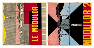
5. Le Corbusier apply the "Vitruvian Man" in to the architecture. He found our the golden ration use it in his Modulor system for the scale of architectural proportion. 


6. Le Corbusier began by learning the art of metal engraving at first, then he was encouraged by a teacher to take up architecture. He built his first house at the age of 18 for a member of his school's teaching staff. 


7. This chair is designed by Le Corbusier during 1928. It was also called as "cushion basket", which he designed as a modernist response to the traditional club chair. These pieces reverse the standard structures of sofas and chairs by having frames that are externalized. 


8. Le Corbusier was awarded the Frank P. Brown Medal in 1961. 


9. Le Corbusier was died on August 27, 1965, a heart attack. He against his doctor's order and went for a swim in the Mediterranean Sea. His body was found by a bathers and he was pronounced dead at 11 a.m..


10. Le Corbusier began experimenting with furniture design in 1928 after inviting the architect, Charlotte Perriand, to join his studio.


Reference:
Five Point of Architecture, http://famusoa.net/achin/courses/le_corbusier/essay-tse-5.pdf


Design with reach, http://www.dwr.com/category/designers/h-l/le-corbusier.do


Youtube, http://www.youtube.com/watch?v=3ChtM71axgA&feature=fvw

Sunday, January 23, 2011

Chapter 4-6 by John Heskett

   I really enjoyed reading chapter 4,5,6 in this book.
   It talks about object, communication and environment.
   The author explain some fact in industrial design for object, graphic design in communication, and interior design in the environment. 
   The interesting part of the object is that people like highly individual and innovative product. Sometime, the product was just very innovative in its visual side, yet it doest useful. The rich people would still buy those expensive and functionless stuff. The high class would buy different stuff from the poor. So The goods are indicators of social and cultural status.  
   Well I think the graphic designer is a tough job. For their design, they have to make their product readable and globalized. In addition, they also have to add their own, special though on it. The designer has to think about their clients cultural background, and in what field this product is gonna be used. Because the graphic design is two-dementional, the only way it can communicate with the viewer is its content. I like the example that the author used to demonstrate the power of graphic design. The passport application form in the U.K. was once a tortuous process, but the effective graphic devices make the process much easier to be understand. 
   As for the environment, I think the interesting part of it is when the interior designer designed a public place, he or she can use different theme to emphasis on "experience" or "fun".  The interior designer can show his or her own thought in the public design. The survey in the book shows that most of the American and Europeans has their own thought about how to decorate their houses, so sometime, its hard for the interior designer to express their own thought a small house owner.

Its interesting to see the difference among these three subjects. There are some differences and connections among these three branches under the design department. 

1. Zaha Hadid


1. Zaha Hadid is a famous architect. She also designed many urbanized product through interior to furniture.

2. She received a mathematic degree before she went to school in Architectural Association school of Architecture in London.

3. Zaha also taught architecture in many schools. Such as the Knowlton School of Architecture (Ohio State University), Harvard university, Columbia University and so on.
MAXXI (one of her famous design)


4. Zaha, in 2004, became the first woman to receive the Pritzker Architecture Prize. (Pritzker Architecture Prize is an award that honor the living architect who produce consistent and significant contribution to humanity and the built environment through the art of architecture.)

5. One of her famous architecture is The Contemporary Art Center in Cincinnati, Ohio. It is her first project in the United States. The famous design feature of this building is the Urban Carpet. My teacher in the architecture 200 talked about this building before. I found a really cool video in youtube. This video explain the main concept of this building.


6. Zaha Hadid formed a formed a studio in 1980, it starts with five employees. For now, her studio has a staff of more than 300 people, and almost half of them are under 30.

7. As we can see, most of her works are asymmetry. It was because when she was a child in Baghdad, she was thrilled by the asymmetric mirror. It evoked her interest in the asymmetry things.

8. I find a video of her famous work in Youtube.
    Some of her famous architects are: Vitra Fire Station, Rosenthal Centre for Contemporary Art, BMW Central Building, Phaeno Science Center, and MAXXI: Italian National Museum of XXI Arts.


9. Zaha has won a lot of international competitions, but many of her winning designs were initially never built, such as the peak Club in Hong Kong (1983) and the Cardiff Bay Opera House in Wales (1994). In 2002, Hadid won the international design competition to design Singapore's one-north masterplan. In 2005, her design won the competition for the new city casino of Basel, Switzerland.

Dancing Tower (signature tower)


10. Signature Tower used to be called Dancing Tower. When she fist present it in her exhibition, people do not really like this tower. The fluid character of the towers is generated through an intrinsically dynamic composition of volumes. The three towers rise above the creek and project themselves as an icon fro the surrounding developments and for the gulf region.


References:
New York Times, Zaha Hadid, http://topics.nytimes.com/topics/reference/timestopics/people/h/zaha_hadid/index.html

Youtube, http://www.youtube.com/watch?v=VIzTtl6Lw7U

Youtube,http://www.youtube.com/watch?v=zmOGB1eCFco

Five things you probably didn't know about Zaha Hadid, http://www.mediabistro.com/unbeige/five-things-you-probably-didnt-know-about-zaha-hadid_b7626

Dancing Towers by Zaha Hadid, http://www.yankodesign.com/2007/04/19/dancing-towers-by-zaha-hadid/

Survey questions

I came up with 8 survey questions, here are my questions and the results.


   My purpose of doing this survey is to know does people's social status makes them pessimistic or positive. My hypothesis is that people who are not close to their family members, and who like cold color are more likely to become pessimistic. 
  Well as you can see, my hypothesis is not quite right. I asked ten people to do my survey, all of them are college students. There are seven people who are close to their family. And there are four people who like warm color, such as link and red. There are three people like to spend time with their friends and 2 people like to spend time alone. The other five people kinda like both. It indicates that most of the people who did the survey like social life. 
   However, there are 8 people have thought about death before. They mentioned that  they would think about death when they are unhappy or being lonely. And they were scared by death. There are six people who like to die for the natural causes like oldness and others want to die in various condition, such as accident and suicide. In addition, some people want to be buried with their family members and some people want to be cremated. 
   I was kind of surprised by the result of my survey. I thought that if people have a good social status or live in a good condition, they would not ever think about death. When people are depressed or unhappy, they would think about pessimistic things, such as death. 

  This survey reminds me of my first time thinking about death. I remembered when my grand father passed away, I attended his funeral. I couldn't sleep that night. I was only six years old, and that was the first time that I saw the dead people. I started to think where would people go after dearth. I remember I thought I was going to become a red flower one the road. This is just a funny story in my childhood :).


Saturday, January 22, 2011

CR03

The class on Wednesday talked about the design process.
I really enjoy the video on class.
The video introduced a studio, which use five days to design a new shopping car.
I remember that there was one person said that they don't care that much about their final product, but they really want to figure out how to use their design process to approach the goal.
The video shows the whole process of their designing.
They did the survey in the supermarket and divided the member in to different groups. Each group tried to solve one major problem for shopping car, such as safety, convenient, capacity, appearance...

Personally, I don't really like their final design. Even though the shopping car looks good, but it didn't solve the problem that the typical shopping car had. It seems that the car can only be used for a short time and still can be stolen.  I also think that their product would cost a lot of money.

I also have a question, this design has been made years ago, if it was a good design, why didn't it apply in our real life?

PS: I think to hang bicycle and umbrella on the celling is a cool idea :)

Wednesday, January 19, 2011

Chapter 1-3 by John Heskett

     The first three chapter of this book basically talked about what is design, the brief history of design, and the significant and utility in design.

     The first chapter tells us that design is closely related to our life. And what designer do is to solve problems and improve the quality of human life. I like the way he used the sentence: "Design is to design a design to produce a design". It explain the different functions and meanings of "design". The Author also tells us that designs are result from the decision and the choices of human being.

     The second chapter introduce the brief history of design. To be honest, I am not really interested in this chapter. It tells us that even though designs transforming natural materials into forms without precedents in previous, it does follow some certain patterns. So it is really important to learn the history of design and learn the social structure and the cultural background in our life.

     As for the Utility and significance, I really like the examples that the author illustrated. For example, the toothpicks are different between Europe and Japan. Japanese toothpick has decoration at the end, which shows their cultural difference and worships in their traditional culture. Even though the globalization becomes more common in current society, each places or country still have their own significant in their culture. The designers should focus on both utilities and the significant for their designed products, so that they can adapted better in different places around the world. And a good designed product should also fulfills both designer's intention and user's needs.

Monday, January 17, 2011

Course Reflection 02

    From the classes in this week I learned that design is not only to make things look good, but also improve the products. Through design, people will live a easier life.
   I like the "Evolution of Chair", which was taught in the first lecture. Personally, I really like the furnitures from different period. I was surprised by Panton Chair (Verner Panton). It looks really modernized, yet it was designed in 1959. And there also many chairs that we can see in our daily life. It makes me feel that design is closely related to our life.
   The teacher also introduced many famous designers in class. I took architecture 200 last quarter, and I saw many architect names during the lecture. I am surprised when I figured out that those architects also designed furnitures, public facilities other than buildings. (I know this might sound stupid)
 

random photos and patterns


Flowers
                                         
I love flowers and i painted this picture last year.
 I basically use yellow and red and blue in this painting. 
I was amaze that there are many variables in one color.

Firework


I took this picture on Chinese new year's eve. 
We play firework on New year's. 
Each year, the sky was lighten up by the fireworks.
The reason that I like firework is because its unique and temporary.
Well, its hard to take a clear picture on firework.


Walls in Bedroom  (In Boston)


I took this picture in my friends home last year. 
This wall is full of pictures from fashion magazine. 
I like the way she arrange it. It is very colorful and seems fashionable.
she also put her artwork on the wall. 


Patterns from my sketch book 1


I used color pen create this drawing. It was on 02/02/2009.
I like the elements in this picture. 
I usually draw the similar pattern in my sketch book. 


Patterns from my sketch book2


I also draw this pattern on my sketch book in 2009.
This pattern seems like butterfly and flowers.
When I started to draw this, I just keep add same pattern from one center.
The pattern seems to grow up by itself. 


Cloth, shoe, and my ipod


I took this picture during the summer in 2008. 
These are all my stuff. Actually I was going to wear those things that day.
I came up an idea to put them on the floor and take a picture of it.
I put my ipod beside my shits and place the headphone to the higher place.
I want to make the viewer to think that it was an actual person who is listening to music.
It was a fun work.


A series instant pictures


This is a series pictures of my previous work.
I used my polaroid camera took 4 pictures, and arrange them on the windowsill.
And I used the digital camera took this picture.

Starbucks

Starbucks logo :) 
People probably see this logo everywhere. 
Starbucks has 3 other logos, which was used in different period of time. 
I like this logo best. I like the combination of green, black and white in this logo.
I also think the women in the center of this logo might mean something important, yet I haven't figure it out yet.

People in white and black 


I found this pattern online. Then I paint it on a white T-shirt.
I like the way the artist present this picture.
Even though, the picture is not colorful, we still can see the emotion on each person.

SKY


This picture is from last year back in China.
I love to look at sky, especially during summer time.
The sky is really clear and the cloud change every time.
Sometime, I just staring at the sky and see the clouds passing by.
The nature is really incredible.


The pattern of the tree


The pattern of the tree. The branches of the tree is pretty random.
I forget when did I take this picture, probably when i was in high school.
The sun behind the tree. It reminds me of life pattern.